
Traffic.
That’s the good stuff, right?
And naturally, you want more of it for your blog.
But did you know that constantly striving to gain traffic can actually lead to a problem?
It’s a problem that can undermine much of the hard work spent building and monetizing your blog.
Want to know what it is?
By focusing on ways to gain traffic, you may be completely ignoring certain factors that cause you to lose it.
Because sending traffic to a blog that makes readers bounce is like pumping water down a leaky pipe.
In that situation, what’s the smarter move – pumping more water, or fixing the leak?
Exactly. Fixing the leak.
And these days, one source of traffic is more likely to bounce than any other:
Mobile.
So, is your blog leaking traffic?
Why You’d Be Totally Crazy to Ignore Your Mobile Visitors
Earlier this year, the Internet changed forever.
And even if you didn’t hear the news, your traffic has likely been affected – perhaps without you knowing.
Because in January of this year, mobile Internet usage exceeded desktop usage for the first time in history.
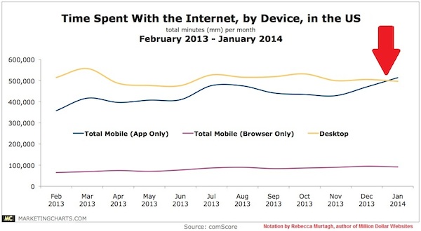
In other words, more people are now accessing the Internet from their mobile device than from a fixed device such as a desktop PC.
And as more and more people choose mobile as their primary device, the more you will suffer as a blogger if you choose to ignore them.
Consider the following statistics:
- 65% of emails get opened first on a mobile device.
- 76% of Facebook’s monthly active users are on mobile.
- 78% of Twitter’s active users are on mobile.
(And if you’re wondering why these figures affect you – just remember that few people will navigate directly to your content. They usually follow a link in an email, or on social media.)
Whatever your views on the explosion of mobile usage, your readers will increasingly be using mobile devices.
You have no choice in how, when, where and on what device your audience chooses to connect with you.
If you choose to ignore this, you risk the following:
- Less Traffic to Your Blog: As mobile usage increases, you could effectively be turning away 20% – 50% of potential traffic to your blog.
- Fewer People Signing Up For Your Email List: Without a mobile-friendly blog and email opt-in forms, new visitors will leave in frustration instead of signing up to your list.
- Potential Readers Lost Forever: A Gomez study found that 46% of mobile users are unlikely to return to a site if they had trouble accessing it from their phones. So first impressions are more important than ever.
Here’s the bottom line.
You’ve worked hard to get where you are, and you’ve worked hard to build your audience.
So you’d be crazy to lose momentum (and readers) by sticking your head in the sand and ignoring this mobile trend.
The Easy Way to Discover How Many Mobile Readers You Already Have
The first step to taking your mobile visitors seriously is to find out what proportion of your blog readers are already using mobile devices.
And the simplest way to do that is by using Google Analytics.
(If you don’t have Google Analytics configured for your blog yet, check out this 60-second guide. But be aware that you’ll need to wait a few days for data to accumulate before following the steps below.)
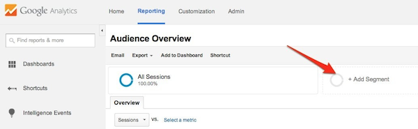
Log in to your Google Analytics dashboard.
Click “Add Segment” in the panel toward the top of the screen.
Check the boxes for “Mobile and Tablet Traffic” and “Mobile Traffic.”
(“Mobile and Tablet Traffic” is all mobile traffic – “Mobile Traffic” is essentially smartphones and other mobile devices minus tablets – e.g., iPad, Kindle Fire, etc.)
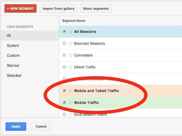
Then click “Apply.”
You’ll be able to see the percentage of visits coming from both mobile devices and tablets in the selected timeframe.
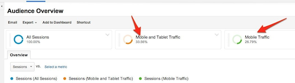
In the last 30 days, almost 34% of all visits to this site have come from mobile devices and tablets and almost 27% of that is from mobile devices alone.
Your percentages are likely to be similar to this, and if mobile usage represents a third of all your visitors, that is a significant section of your audience and certainly worth taking care of.
As mobile Internet usage continues to grow, don’t be surprised if 50% of all of your potential traffic comes from mobile within the next two years.
But what if mobile is just a small percentage of your audience?
If mobile traffic is only a small proportion of your total traffic, it’s possible that your particular audience may not be heavy users of mobile.
But there’s a more likely explanation.
Your blog may be so mobile-unfriendly that anyone visiting from a mobile device bounces away almost immediately, barely leaving a trace on your traffic stats.
So use the following steps to ensure your blog is prepared for this brave new mobile-centric world.
Step 1: Make Sure Your Blog Theme Is Mobile-Friendly
Have you ever received an email on your smartphone with an irresistible headline that you just had to click?
But you follow the link and… BAM! You can hardly read the content because the text is so tiny and you’re forced to pinch and zoom to find your way around.
It’s frustrating, right?
And a surefire way to push readers away.
Has it ever occurred to you that your blog might be doing the same?
You might already know whether your blog is mobile-friendly, but if not, try it now.
If you have to pinch and zoom (instead of just scroll and tap) to read the content and navigate the site, your site is not mobile-friendly.
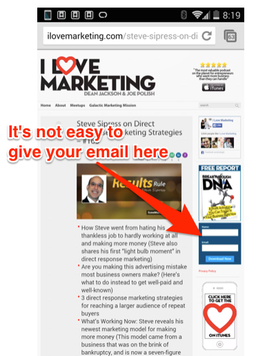
Here’s an example:
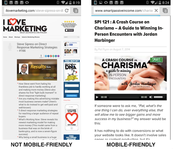
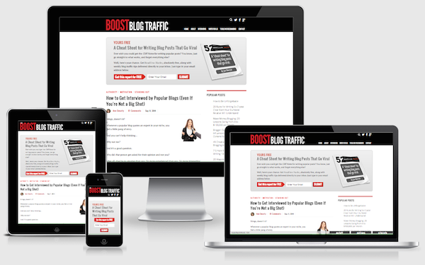
On the left we have I Love Marketing, and on the right we have Smart Passive Income.
See how Smart Passive Income is much better optimized for mobile? The headline is clearer, the body text is larger and precious space is not being taken up by a sidebar (which in the case of I Love Marketing contains widgets that are too small to be useful anyway).
Go ahead and visit these sites on your mobile device and see for yourself.
Then check your blog. How does it look?
Of course, even if your site displays well on your smartphone or tablet, that’s no guarantee it looks equally good at other resolutions.
The answer is to use a tool like Screenfly by Quirk Tools, which shows you what your website looks like on various devices.
All you need to do is enter your website URL and then select the device you want to see your site on. Below you can see the many options to choose from within smartphones alone.
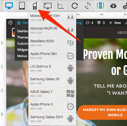
Warning: If you have a separate mobile website hosted at m.yourdomain.com, this tool won’t detect it, so check out your site on a real device first.
If your blog’s performance on mobile devices leaves something to be desired, you have a couple of options to make it more mobile-friendly:
- Create a separate, mobile-only version of your blog.
- Use a mobile-responsive theme across your entire site.
1) Create a Separate, Mobile-Only Version of Your Blog
If you’re starting a blog using WordPress, the easiest and most affordable way to improve your blog’s performance on mobile devices is to install a plugin that automatically presents a mobile-optimized version of your blog to mobile users. (Desktop users will continue to see the current version of your site.)
One of the leading plugins in this space is WPtouch Pro, which offers a selection of different mobile themes for a one-time cost of $49.
Social Media Examiner uses WPtouch Pro:
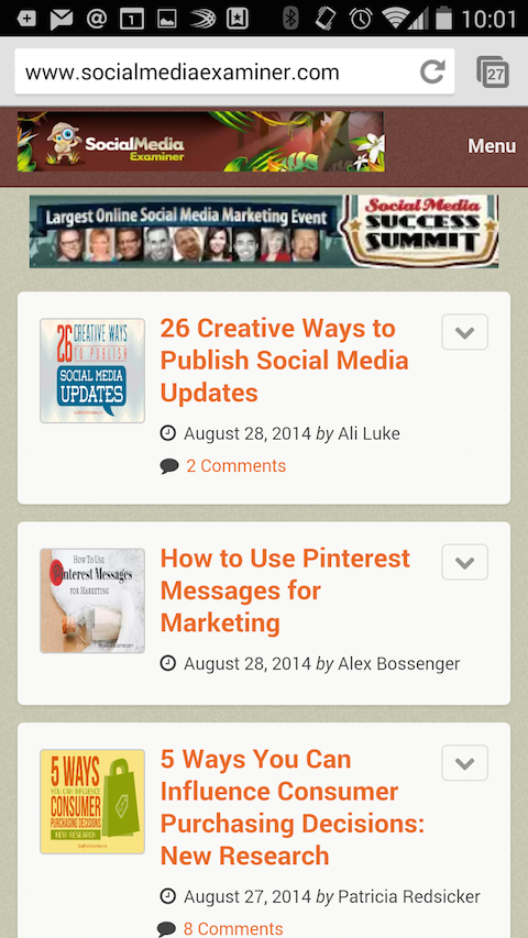
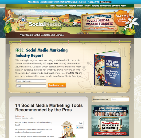
Compare this simpler, mobile-friendly layout to the full desktop site and you’ll see the advantages of the plugin for mobile users:
2) Install a Mobile-Responsive Theme Across Your Entire Site
If you use self-hosted WordPress (and you should), the odds that you’re already using a mobile-responsive theme are higher than ever.
But what exactly is a mobile-responsive theme?
A mobile-responsive theme detects the screen size of the visitor’s device and adapts accordingly. That means dynamically adjusting the layout, image sizes and font sizes depending on the amount of screen “real estate” available.
Here’s an example:
Note that WPtouch Pro also does this to some extent, but only for mobile devices (at various screen sizes) – i.e., not full-size desktop resolutions.
A mobile-responsive theme uses a consistent design across all device resolutions (including desktop).
A number of places offer high-quality, mobile-responsive themes. Here are just a few:
Some free mobile-responsive themes are available, but expect to pay up to $100 for a professional theme with good technical support.
If you decide to hire a designer and go custom, here are nine examples that you could mimic.
Step 2: Replace Text Links with Tappable Buttons and Menus
Websites that are not optimized for mobile users can give visitors a bad case of “Fat Finger Syndrome.”
Fat Finger Syndrome occurs when a website’s links and buttons are too small for visitors to easily and accurately tap with their finger (or thumb).
As bloggers, we can easily forget that not all of our readers are navigating our blogs with a mouse (or trackpad) and pointer, and this can lead to a frustrating user experience.
Even if you have a mobile-responsive theme, some elements of your navigation may still have this issue.
How Big Should Touch Targets Be?
Apple’s iPhone Human Interface Guidelines recommend a minimum target size of 44 pixels wide and 44 pixels tall.
Microsoft’s Windows Phone UI Design and Interaction Guide suggests a touch target size of 34 pixels with a minimum touch target size of 26 pixels.
Nokia’s developer guidelines suggest that the target size should be no smaller than 0.7 cm x 0.7 cm square or 48 x 48 pixels.
As you can see, guidelines vary, but the point is that by not making buttons large enough, or by having too many text links, you risk frustrating visitors.
Just remember that 46% of users will never return if they have a poor experience.
Let’s look at an example.
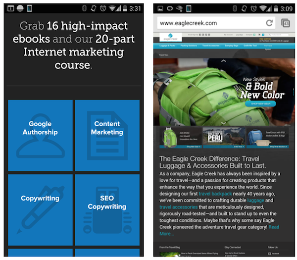
You should be able to see that clicking to download a copywriting e-book from Copyblogger will be a lot easier than trying to click the tiny “luggage” text link on Eagle Creek’s website on the right.
So when creating buttons, make sure they are large, tappable and have enough space surrounding the outer areas.
And when using simple text links, make sure they don’t crowd (where two or more links appear close together) on mobile devices and lead to another case of Fat Finger Syndrome.
For example, the main navigation on Eagle Creek is nearly impossible to read at low resolutions, and the menu options suffer from crowding.
How to Create Mobile-Friendly Buttons and Menus
Various plugins are available to make simple text buttons using WordPress shortcodes. For instance, this plugin creates buttons like the following:
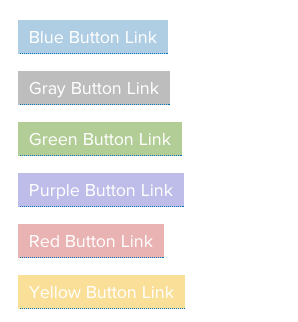
This button style is particularly useful for creating a call-to-action button.
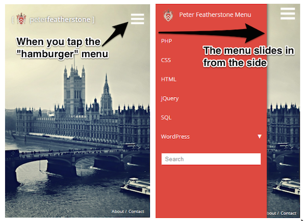
To quickly fix a difficult-to-navigate menu like Eagle Creek’s, you could use a plugin that creates a more mobile-friendly navigation menu.
Responsive Menu provides an app-style menu – sometimes called a “hamburger” menu.
Step 3: Make Sure Your Opt-in Forms and Payment Forms Are Mobile-Friendly
Every blogger wants more traffic, right?
But do you ever think why?
Usually it’s because you want to convert that traffic into something else – like signups or even product sales.
But if your opt-in forms are not optimized for mobile, visitors will struggle to give you their email addresses.
And if your payment forms are designed for large screens only, visitors will struggle to hand over their credit card details.
So you’d be smart to see how your forms behave on small screens.
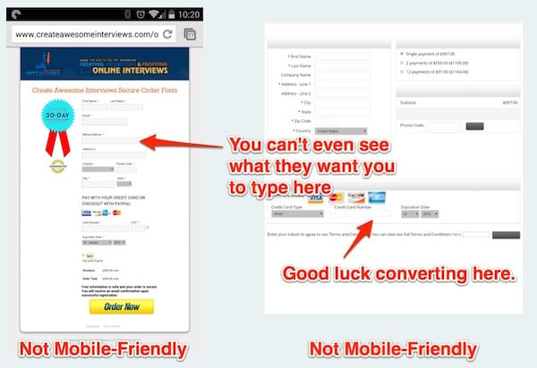
How to Check If Your Forms Are Mobile-Friendly
As before, there’s a pragmatic test of mobile friendliness – visit your signup or product landing pages from your favorite mobile device and go through the process yourself.
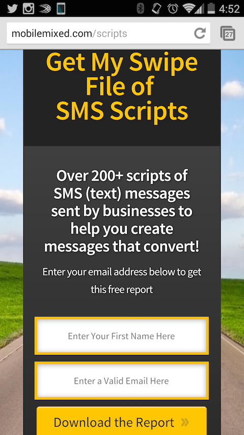
As you can see below, I’d have to pinch and zoom to give I Love Marketing my name and email address, so the experience is not optimal:
And if visitors have a similar problem with your checkout form, you’re likely to lose sales too:
The Right Way to Capture Emails on Mobile
As with some of the earlier usability problems, here WordPress plugins come to the rescue.
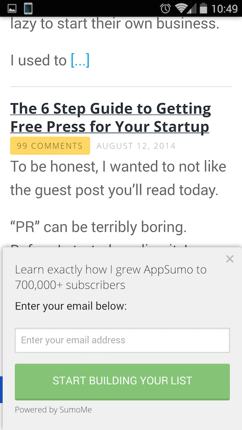
SumoMe and OptInMonster both make it easy to create mobile-friendly opt-in forms on your blog (affiliate link).
You can see a SumoMe pop-over in action below on Noah Kagan’s site Okdork.com.
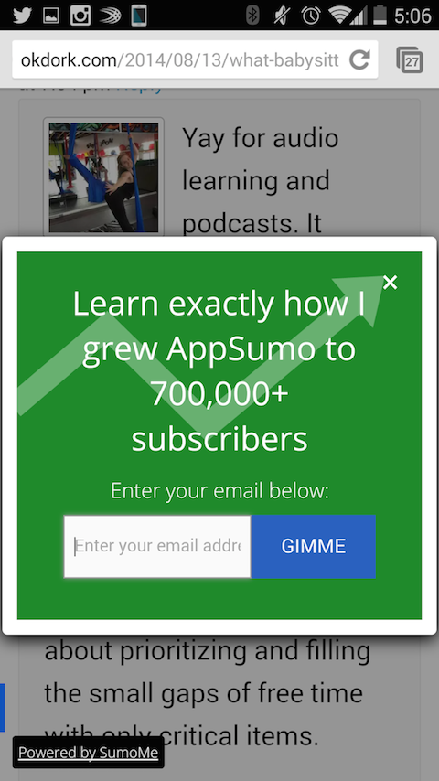
SumoMo also has a neat feature that triggers an opt-in box to appear as the reader scrolls down your blog.
I’ve increased my site-wide conversion rate by 8-10% by using pop-overs with unique lead magnets.
A mobile-responsive design or a plugin like SumoMe can help ensure that on-site sign-up forms render well on mobile.
But you can also use a tool like LeadPages to create dedicated off-site landing pages for capturing email addresses.
In addition, the LeadBoxes feature lets you make any link, image or button trigger a mobile-responsive pop-over.
Here is an example of a page I created in minutes using LeadPages to build my email list:
LeadPages is a more expensive product, but if you are creating several different pages (opt-in pages, registration pages, thank you pages, etc.) it can be a worthwhile investment.
Use 3rd-Party Tools for a Mobile-Friendly Checkout Experience
If you sell products from your blog, the easier the checkout process, the more sales you’ll make. It’s that simple.
If a reader wanted to buy from your site, would it be easy?
Because this is one place where you don’t want to give your visitors anything less than a smooth experience.
Here are three options for letting your customers checkout from your site on a mobile device.
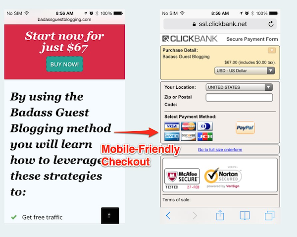
1. ClickBank
A third-party shopping cart like ClickBank gives customers a seamless and mobile-optimized experience when buying your digital products.
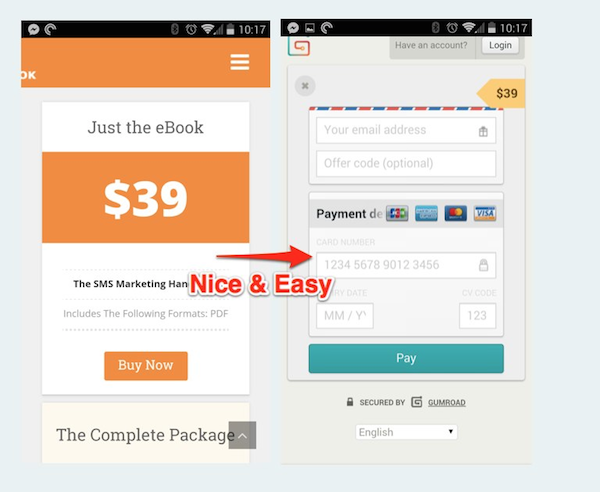
2. Gumroad
Gumroad offers a simple solution that is by far one of the easiest mobile checkouts I’ve ever seen on a mobile device.
I created the following form for my digital product The SMS Marketing Handbook in just a few minutes without any specialist technical know-how:
3. Custom Forms
This option isn’t for everyone, but if you’re looking for a payment solution that integrates seamlessly with your blog, you could hire a developer to implement Authorize.net or 1 Shopping Cart.
If you have a significant list, you may consider a more complete “backend” solution like Infusionsoft or Ontraport.
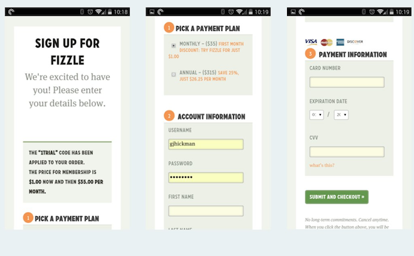
My friends over at Fizzle.co offer an amazing mobile checkout experience that was custom built to integrate with their site design:
Step 4: Create Snackable Content Mobile Users Will Love
Have you ever caught yourself quickly scanning through articles on your phone – more so than you would on your laptop or PC?
Well, studies show that people are more task oriented on mobile devices. Visitors to your site are usually looking for something specific – perhaps lured in by a great headline shared on social media.
As a result, you should try to make your content more snackable – in other words, easy to consume in small pieces – so that readers can find what they’re looking for quickly.
Here’s how to do it (and these work for emails, as well as blog posts):
- Open with a short, punchy headlines in a large font. Think 10 words or fewer and 16 points or larger. (A mobile-responsive theme should handle the font size automatically, but if you’re a CSS whiz, you could write your own media query.)
- Write irresistible subheads. These help break your content into clearly labeled bite-sized sections.
- Use bulleted points and numbered lists. These add visual variety and help the user identify key information.
- Embed images within the sub-sections. This helps to break up the content further, and makes it easier to navigate visually.
Here is a great example from a blogger and friend, James Clear:

Bonus Idea: Snackable Audio Content
Know what else is snackable? Audio!
Not everyone likes reading – some people prefer to consume information by listening instead.
In fact, did you know that over 65% of podcasts are listened to from mobile phones?
Audio is the most mobile content there is!
And audio represents an opportunity to get your content in front of a whole new audience.
So once you’ve written you next blog post, why not record yourself reading it using a USB microphone or headset?
Then you can add that file to your site, submit it to iTunes, Stitcher Radio and SoundCloud.
I’ve personally seen an increase in traffic of over 2,000% on posts that I also released as audio.
To give another example, Jason and Jeremy over at Internet Business Mastery have been audio blogging for about a year now.
They wrote a blog post titled “The First Key to Online Business Success.”
The original blog post got 2,755 visits.
The audio blog version got 28,770 unique downloads.
Impressive, right?
Repurposing your content can capture the attention of people that don’t like to read content, or at least don’t want to read it on a mobile device.
Step 5: Create Emails That Look Awesome on Mobile
Making your blog and its content mobile-friendly is a huge step forward. But you also need to think beyond your blog.
You’ll have been told a thousand times to build your email list, and if you’re following that excellent advice, you’ll want to make sure the emails to your list are mobile-friendly too.
After all, 65% of all emails are first opened on a mobile device, and if those emails don’t look great on a phone, you’re effectively crippling the effectiveness of your hard-won list.
Many bloggers use services such as AWeber, MailChimp or Constant Contact to manage their email lists, and thankfully these tools make sending mobile-friendly email easy with mobile-responsive templates.
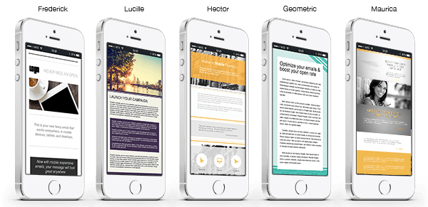
So if you’re not building a list yet, choosing an email provider that offers mobile-responsive email templates is essential.
Even if you’re not using an email template that is optimized for mobile, you can improve the mobile experience by choosing a single-column template. Typically, having more than one column will lead to the pinch and zoom problem on a mobile device.
How to Make Sure Mobile Users Can’t Resist Opening Your Emails
Of course, before your readers even get to see how beautiful your emails look on their mobile devices, you need to persuade them to open them.
And although much of the popular advice about getting your email opened still applies, the rules are a little different on mobile.
Why the Sender’s Name is So Important
When sending emails, you can choose the display name of the sender, which is shown in place of the sender’s email address.
But on mobile devices, the sender’s name is usually given more prominence than the subject line when compared to desktop email.
So make sure the display name is clear, and your recipient knows exactly who the email is from, because confusion will only reduce open rates.
And don’t simply use an email address like news@yourblog.com – it’s too impersonal for the type of relationship you want to create with your readers.
The 5 to 7 Words Rule for Subject Lines
On a desktop PC, the screen is usually large enough that even long subject lines are visible in their entirety.
But on mobile, the subject line may be truncated after just five to seven words due to limited space.
This means that you often only have the first few words of your email subject line to persuade people to open your email.
Compare the two emails below as viewed on an iPhone.
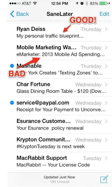
See how the email from Ryan Deiss is short, sweet and intriguing, whereas the email from Mobile Marketing Watch has a long subject line that gets cut off before it becomes meaningful.
Join the Mobile Revolution and Stop Leaking Traffic from Your Blog
If you take one idea away from this post, make it this one:
If you’re serious about traffic, you need to get serious about mobile.
In the future, around half of all your potential traffic could originate from mobile devices.
So your blog needs to catch up.
After all, what’s the point of going after new traffic if your blog is effectively throwing half of that traffic away? And if you don’t take steps to woo mobile users, you’ll find yourself working harder and harder to maintain the growth of your blog.
While other bloggers ride the wave of the mobile revolution.
So follow the five steps above to plug the leaks in your blog.
Because the sooner you start, the sooner that mobile traffic will come rolling in.


Excellent post, Greg. I didn’t know about Screenfly. Great tip. Thanks for compiling and sharing all this great mobile info.
Thanks Mark! I’m glad you enjoyed and I like Screenfly too. It’s a good tool.
Yeah! mobile user interface optimization is old thing, But I believe Some peoples are going with the old webpages, Nowadays All webpages are best to move responsive and this time overlapped to do responsive design, Thanks Greg.
Hi Greg,
You’re absolutely right about mobile devices. The trends in my Google Analytics account for Be A Better Blogger indicates exactly what you’re saying — as more and more time goes by, the more my readership is shifting to mobile (and tablet) devices.
Like BBT, I use a mobile-responsive theme. If you’re a self-hosted Wordpress user, there’s lots of free options available to you. The Jetpack Mobile Theme, for example.
Also like your points about mobile-friendly opt-in forms. I recently signed up for LeadPages for this very reason. I’ve started using SumoMe (one of the plugins you mentioned), too. It’s worked quite well so far.
Thanks for the great thoughts, Greg! I’ll have to give your post a second read to make sure I didn’t miss anything.
Have a great day!
– Kevin
Thanks Kevin! You’re off to a great start and yes Jetpack does do some heavy lifting. Leveraging LeadPages and SumoMe are great additions to the tool chest. 🙂
It’s a mobile world my friend. Let’s capitalize on it.
Fantastic post, Greg! I’m working on making my blog/website more mobile friendly and these are killer tips. Thanks!
Awesome Elke! I’m glad it helped!
Hey Greg,
Great post! Although I’m using a mobile responsive theme, I’d never heard of Screenfly, so I wasn’t aware I could test it for any device. Thanks so much for this one, now I can stop asking to borrow strangers’ smartphones. 😉
As a travel blogger, I get to see firsthand what an increasingly mobile world it is. Although I always bring my tablet-PC for blogging purposes, I know a lot of travelers use only their smartphones.
I hadn’t thought yet of recording & releasing an audio version of my posts. I knew that YouTube videos & podcasts were something I eventually want to move towards, but I was thinking those would be something additional to my blog posts (so of course they keep getting bumped down my to-do list). A simple audio recording is something that wouldn’t require a ton of extra effort, since the research, structure & writing would already be done. Excellent idea.
I also agree with the importance of a mobile friendly email subject line. In my past life (when I still had a company iPhone) I read 90% of my email on my phone. People are inundated with emails these days, and nobody’s going to open yours if they have to guess what it’s about.
Thanks for the informative post. Already bookmarked. Have a great weekend!
– Mandie
Thanks Mandie! Audio blog for the win! Sounds like you can totally do this with not much extra effort so I’d start there.
Let me know how I can help!
Lovely post that informs the usually less-talked-about mobile platform and increasing conversion tactics.
In my experience leading with a mobile responsive feature box on top (as I do for desktop users) gives me the best fighting chance for solid conversion rates.
1) post/articles/etc are elongated with working is restrict pixel widths on mobile. Therefore your lead will require reading the entire post before the attempt to covert, it’s best to capture head on up on top, while you have their “best interest”. But then again, pop ups could do just that is a more interested way.
What are everyone else’s thoughts?
Definitely something to test Jesse. I see people opt-in in my pop-ups from mobile and also the lead box.
Incredible post, Greg.
I only just recently started noticing my mobile stats in Google Analytics, thanks for clearly explaining why these are so critical! 🙂
PS – I’m launching my podcast now… fantastic tip on repurposing our written blog content!
Leanne! Congrats on launching the podcast and the “audio blog” is a quick hit that adds extra value and puts that content in front of a new audience. 🙂
Hi Greg,
Wow! Great, informative and step-by-step oriented post! The stats you brought up makes us realize that there is no way we could ignore the mobile world!
I personally use Leadpages. They do a tremendous job with their mobile responsive pages. Bye bye fat finger syndrome!
I resonate with you when you talk about bringing our written content into audio, for example by having a podcast. Podcasting has been one of my marketing strategies. It is another way to speak directly to your avatar and have a conversation with him.
Fabienne, LeadPages is rad right? 🙂
Podcasting has been great for me and I mix in my repurposed audio blog as well. Great combo!
Mobile has become such a big part of the internet it’s a must. Anyone that isn’t gearing up for it is missing out in a big way. I still think a lot of off the shelf themes have a long way to go in terms of being fully responsive and creating sites that work perfectly on all resolutions, but they’re getting there. I definitely think the thing about having a theme that converts small text links into big icon buttons is a big thing that is missing from a lot of themes. Surely it should be easy enough to do with a half decent development team.
Luke, themes are making huge strides for sure and you need to be picky. 🙂 Custom is a nice alternative too. 🙂
I’ve known for a while now that I needed to do this, but I just checked to see what percentage of my readers are using mobile and was surprised to see that it’s over 60%! My absolute BIGGEST concern is loss of revenue when switching to a mobile friendly theme. Right now one of my biggest revenue generators is an adsense ad that appears at the top of posts that are older than 4 days. That and several sidebar ads that won’t be displayed on mobile. Has anyone found a good solution for ads on mobile?
Hey Amanda, 60% wow! Time to make moves. I haven’t seen great solutions for AdSense ads thus far unfortunately and the ones i’ve seen have broken the themes.
Are the ads making money from desktop or mobile?
Looks like 63% of my earnings are from desktops, 20% from tablets and 17% from high end mobile devices. I’ll be honest, I’ve never looked at that report before and had to google how to find it! So if I’m reading that correctly, even if I switch to a mobile friendly theme, I shouldn’t actually lose too much revenue?
And I should probably add that about HALF of my adsense revenue comes from that one spot i was referring to (on posts older than 4 days). That’s why I was so concerned about it. But if most of my revenue is still coming from desktops…
Doesn’t seem like it’s bad now but I would definitely explore ways to integrate those ads sooner rather than later. It’s not an excuse to miss out on 17% of earnings. At least, you shouldn’t want to neglect those users.
Useful tool. Thanks http://quirktools.com/screenfly/
You bet Brad
Great post with great actionable content!
Thanks John, glad you enjoyed. 🙂
Hey Greg, This is the first article that I read on boostblogtraffic. Really the way you explained, amazed me. I don’t know how I read such a big article without boring.
Glad you enjoyed Nishant!
Hey Greg, at first I was a little annoyed by your title (being told what I must do now), but it got me to click on the link ha! I appreciate you writing this article as I have 55% (!) traffic from mobile and tablets. Thanks for the good suggestions, I specifically like the idea of making titles short and sweet.
Blessings,
Trevor
Thanks Trevor! Glad you enjoyed and yes, short, sweet titles are where it’s at.
55%! So the headline was right my friend. 🙂
Wow Greg! What a comprehensive post!!! Thank you!
I’ve been listening to your podcast and particularly liked the first one you did with John Lee Dumas. In fact I mentioned that podcast to John when I spoke to him very briefly a couple of months ago.
This post rocks! There is so much information in here.
I can’t tell you how many times I wondered what I can do for my (inevitably growing) mobile audience — and I think WP Touch Pro. Great tip. Thanks!
You bet Ash, glad you liked it. WPTouch Pro is a great start my friend. JLD is a good buddy of mine and has a great show. Thanks for checking out the podcast. 🙂
Wow, first time I can say I scored an A+ for my website on a blog post at BoostBlogTraffic – yay :). With Genesis Framework, Gumroad, Aweber, hot headlines and simple text messages for email, I feel good about the set-up for mobile users. Thanks so much for such an in-depth post here, Greg. I’ll be sharing it!
Boom! Nice work. and thanks!
Wow! This is 5 shades of awesome… plus a bonus shade of freakin’ sweet!
I have a few sites and found that one of them needs a LOT of work to make it mobile friendly. A ton of work. Thanks for the heads up and kick in the tail! And the subject line e-mail advice is killer!
Thanks Nick!
That is the amazing put up! I just see I’m sure sometimes stumped learn how to take on your blog page to that particular ‘next’ quality, not to mention morning attempting can typically the tips and hints most people named above. it was in fact a particular instructive put up And very competent for newbie’s expecting your website; each one of ideas are really helpful for you and me. cultivate monetary management give good results.
A large number of thank you for the purpose of showing a instructive practical knowledge.
I’m glad it was helpful! 🙂
Fantastic post, lots of great resources here. Great work!
Thanks Andrew, glad you enjoyed
Hi Greg,
Indeed a Great article. You have put forward your thoughts in front of us in very effective way. All these tips are great. over all your article is informative, inspirational and instructive. Thanks for sharing such an informative post.
Thanks Muhammad, I appreciate it and glad you enjoyed it.
Wow, this stuff is super valuable. Thanks, Greg.
I have dabbled in almost all of the tools mentioned in the post. But never in a focused manner. That’s why I decided to move my site to the Rainmaker Platform. It does 80% of this stuff, and leaves me to to only deal with the content and headlines. That’s worth paying for.
I heard the Rainmaker platform is pretty cool.
It is pretty cool. Anything that comes from Brian Clark & Co. is bound to be.
Hi Greg,
Great post, thanks for the useful information! 🙂
It is so true that those with internet businesses should be focusing more on accommodating their mobile users as well as their desktop users. With tablets and mobiles becoming more prominent these days (as people can work on the move), it is only going to get more important too!
We are using OptimizePress and it seems to format our site to mobile automatically, which is great for me as we are primarily online marketers and are not overly tech-savvy – we like to keep it simple! 🙂
Chris, OP is mobile friendly and I use it for my membership sites. : )
Hi Greg,
I’ve been circling the globe for 40 months in a row.
Writing these words from Fiji now.
I can say I’ve seen rice field workers in Vietnam checking their mobile devices, people in the mountains of Laos checking mobile and folks in the jungles of Bali checking mobile too.
Of course I’ve seen the more traditionally-seen couples not chatting in airports, or when out to eat, glued to their smart phones. Not a good trend, but it is what it is.
Just last week here in Savusavu, I saw a couple go through about a full meal without saying anything. Text, text, scroll, read.
These folks check their blogs on mobile, so make it mobile ready.
I’d be pretty silly blogging from paradise if I didn’t make my blog mobile friendly because all I see all around the world is mobile adoption going skyward.
My blog looks nice and clean on my Android tablet and I must say, it gives me greater confidence and clarity in all I do, blogging-wise.
Smart post Greg!
Tweeting soon.
Ryan
Thanks Ryan.
Hey Greg, thanks for sharing this. Mobile is something that none of us can ignore. It is the way forward for web browsing and we need to pay it the attention it deserves.
Of course. Cheers!
Hi Greg,
Thank you for your very useful information. I appreciate that you looked it up to share with us all. Great Work.
Regards,
Suman
Great post, Greg!
Considering the increase in mobile traffic year-on-year, I gotta say, if there’s one thing that one must prioritize from these 5 actions, it should be increasing conversions for mobile users.
This is true my friend. 🙂
Your article is very helpful thank you very much for sharing .
Hi Greg,
Thanks for sharing this.
I personally do not have good experience with mobile traffic as the conversion is awful for my landing page.
But after reading your blog post, I think I seriously need to relook again and try out this mobile traffic source again.
Thanks again for sharing 🙂
Zack
You bet Zack. Something to look into for sure. 🙂 Try out LeadPages for the opt-in/sales pages.
Hey Greg,
I didn’t realize google analytics could measure this, very useful info. Your right on about the studiopress theme. I have been using it and it’s very moble friendly.
Thanks for sharing!
Rob
Hi Greg,
I’m a novelist, scientist (specifically astronomer), and climate change activist. I don’t need to collect information from my readers and I don’t get money from my blog. For the longest time, I thought that SEOing was really the only option for traffic increases. Now that I know making my blog mobile-friendly is so important, I’m eager to do so, but I know nothing about web programming and short codes. Do you have any advice for an amateur (primarily novelist) like me? I blog because I really want people to read my stuff, even if not for money…
Follow-up to my above comment…
Thanks for the article! I’m using a mobile-friendly theme and have the mobile site option enabled, so I guess I’m asking if I need to do more than that. I would love to be aware of my mobile stats versus desktop stats but I’m completely lost when it comes to shortcode and all other “code” nonsense…is that something I can navigate my way around, or am I going to have to figure it out?
Greg this is kick ass for value and after having you on my podcast and knowing I needed to get my website mobile optimized so I’m so thrilled to have had it go live just two days ago.
I should have seen screenfly first which is a great tool but it’s amazing the feedback I’ve had and the increase in sales already just from people finding it easy to navigate. Thanks for the tips that got me started in the redesign.
You bet Natalie! So glad I can help and glad you joined us in the mobile revolution!
Hi Greg,
I’ve been spending a lot of time recently making sure that my blog is mobile friendly and so your post was very timely.
I hadn’t really thought about the ‘clickability’ of links, so that’s something to definitely think about.
I loved the Screenfly suggestion – exactly what I was looking for!
Dan
Glad you enjoyed Dan!
Hey Greg,
Really good post here. Being mobile friendly is certainly important and it becomes more and more important each and every day. The thing I really found interesting was the pop-over. I had a pop-over on my site before that I took down probably 5 months ago because it wasn’t mobile friendly and I didn’t know it.
Around that time, I noticed that I was getting alot of mobile visitors to my blog but what I didn’t know, until one of them told me, was that they weren’t able to close the pop-over from their mobile device. The X wouldn’t click and then they ended up leaving the site rather than read the content because they couldn’t access it.
Checked the stats and it was true. About 85% of the people left that were on mobile devices because of that. So finding a mobile friendly pop-over is super important.
Truly great post, Greg.
Have a great weekend.
– Andrew
Great article. Thanks for the tips.
Epic content Greg. Tons of goodies in this one. Have a great day!
very nice article. Very educative and detailed. Write a review about this http://southbeams.site90.net, it contains an in-depth analysis of the methods above.
This post could not have come at a better time. I get a decent amount of mobile traffic and need to optimize my site for it. I cant wait to go through each of the points above to make it better, thanks!
Love the part about the first few words of the email for mobile devices. I do that and I didn’t even realise my list probably does too!! Super easy to understand!
Thanks for drawing my attention to this Greg. Always best to optimize what you already have than going out looking for something new.
Nice blog. This blogs help to improve your marketing and boost your site. am going to try it..
Thanks for sharing…
Great article!! My only question would be how you are still able to show mobile readers advertisements. I know on the big screen they are easily spotted in the side bar. Are the mobile friendly apps making it harder to show off ads?
Mobile is increasing day by all.