Admit it.
You’re jealous.
You see the blogs of your online heroes and they all seem to have something you don’t.
It’s right there at the top of the site and it’s practically taunting you.
A fancy, artsy, graphical logo.
Tiny Buddha has one. KISSMetrics has one. SmartPassiveIncome has one.
And you want one too.
After all, it’s not much fun being a wallflower online.
Nobody wants to be boring. Unremarkable is practically a capital crime.
You want to stand out, be noticed. You want to show people you mean business.
And a fancy schmancy logo is the way to do it. Right?
Why Logo Envy is a Deadly Distraction for Bloggers
On the surface, having a fancy logo when you start your blog seems like a smart idea.
You want to grab your reader’s attention the moment they land on your blog, and a striking graphical logo is a great way to do just that.
But if your blog is still in the early-growth stage, focusing on a logo can become a huge distraction.
It can send you down a design “rabbit hole” that will waste a tremendous amount of your time and money – especially in the early days, when you’re still refining exactly who you’ll write for, and what topics you’ll cover.
You could pay a designer hundreds of dollars to develop something only to discard it because it no longer reflects the focus of your blog.
And crucially, it distracts you from writing great content for your blog and from connecting with other bloggers – both of which will fuel your growth.
So for most bloggers, a fancy logo is the last thing they need.
That said, let’s get something obvious out of the way:
Never take a standard blog theme, install it on your site, and leave it as is.
If you do that, your blog will look identical to the blogs owned by everyone else who bought that same theme.
Hardly what you’d call attention-grabbing.
So the instinct to create a distinctive visual brand is a good one. We just need to channel that energy in the right direction.
But before we do, let’s make sure we’re all on the same page by talking a little logo lingo.
How Well Do You Know Your Logo Types?
Graphical logos are what you and I think of first when someone says the word “logo.” They’re the:
- Mermaid on the Starbucks cup
- Golden arches of McDonalds
- Apple with a bite out of it on Apple products
But some of the largest businesses and most-popular websites in the world use another type of logo.
It’s the wordmark logo, and it uses the name of the brand as the foundation for the logo. You’ve seen this when you visit the following sites:
- Yahoo!
- Business Insider
- Copyblogger

If your blog name has a power word in it (e.g. Business Insider, Yahoo!), Wordmark logos are especially effective.
They are relatively easy to create, too, even if you’re not a designer.
And because many blogs change their focus over the years as they build and get to know their audiences, a wordmark logo won’t saddle you with a distracting, expensive symbol that soon becomes outdated.
So if you think you want a fancy logo for your blog, a wordmark logo is what you need instead.
The Ingredients of a Successful Wordmark Logo
Before you set out to create your own wordmark logo, let’s review what makes a good one.
A successful wordmark logo design does the following:
- It is readable and clear, even when reduced down to a small size.
- The font choice and colors say something about the kind of visitor you want to attract (more on this later).
- It’s just quirky and unique enough to be memorable.
Want to peek at some successful wordmark logos? I’ve created a collection on a Pinterest board.
I’ll add to the board over time, so follow it if you’d like ongoing inspiration.
How to Create Your Own Wordmark Logo in 3 Easy Steps
Use the following steps to create a distinctive wordmark logo for your blog without large investments of time and money.
1. Decide who you want to attract
Before you tackle any kind of design project, take a step back and think hard about your ideal reader.
If your blog is up and running, hopefully you’ll have gone through a process like this at the beginning.
But if you didn’t, or you need a refresher, the basic steps are as follows:
- Identify who you want to reach by their basic demographic information: their gender, age range, income, education level. If you don’t know, make an educated guess about who you want to attract.
- Think about what this group needs. What is their day-to-day life like, and what are their challenges?
- Uncover what companies or brands your ideal reader currently admires and trusts. Who do they look up to? And why? This will give you inspiration for the wordmark you create.
When you know this information about your ideal reader, creating a visual brand that they can relate to will be much easier. You’ll understand their needs, and know how to communicate your solution to them.
For example, a younger demographic group reading a technology blog might expect a sans-serif font (similar to Helvetica) and bright, “young” colors.
An older group reading an investment blog might expect a serif font (similar to Georgia) and “corporate” colors like dark blue and green.
2. Choose a font to match your blog’s personality
When your logo is a wordmark, the font choice is crucial. It’s the visual element that will most clearly communicate your brand personality.
(Don’t know your brand personality? Take the brand personality quiz here.)
Your brand personality expresses what your blog or business represents, and humanizes your brand by assigning it personality traits.
When you understand both who you want to attract, and what kind of personality you want to express, your font choice is easier.
And when reviewing the thousands of available free fonts on sites like FontSquirrel.com and Google Fonts, keep the following characteristics in mind:
- Aim for readability first. Your wordmark must be easy-to-read when reduced in size, or used as a watermark on an image.
- Avoid the usual suspects. Stay away from the standard fonts you have on your computer: Times Roman, Helvetica, Georgia, Verdana, Trebuchet, and the rest. These don’t have enough personality to lend to your brand.
- Try your blog name using different fonts. Happy coincidences occur when you use the font viewing capabilities: you’ll discover how specific letters in your blog name are especially interesting in some fonts over others. This will help you decide which ones to try in a wordmark logo.
Google allows you to examine and compare different fonts so you can decide which one to use for your wordmark.
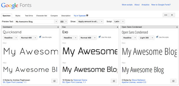
As you find fonts you’d like to consider for your logo, click Add to Collection next to the font. At the top of the screen, choose Word and type in the name of your blog (or whatever you want your wordmark to say).
Then, back on the bottom, click Review. You’ll see all the fonts you chose, lined up next to each other so you can compare them easily.
3. Set the type … carefully
Here’s the final and most-important step: set your type.
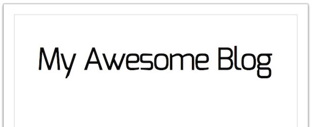
You could easily gloss over this step, but don’t because it’s important. Many fonts are drawn to look great at body text sizes, but when you enlarge them to the size you’ll use for your wordmark logo, the letter spacing will be off.
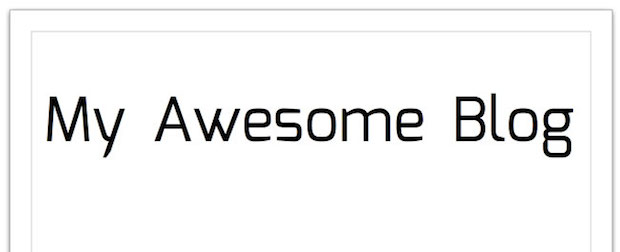
The effect you want to aim for is a group of cozy letters that are standing close together for a family photo, like this:
To accomplish this, you’ll need software that will allow you to adjust letter spacing. If you use any of the Adobe Creative Suite products like Photoshop, Illustrator, or InDesign, this is baked into the software.
But you don’t need $700 software to create a wordmark. You can use OpenOffice Draw to create a wordmark with nice, tight letter spacing.
You’ll need to download and install the fonts you want to try on your computer.
Then grab your free copy of the OpenOffice suite here.
Once inside OpenOffice Draw, type the name of your blog, and apply your custom font. Make it nice and large – at least 80 points.
Now, adjust letter spacing. Click F11, or go to Format > Character. Under the Position tab, look for Spacing. In the drop down menu, select Condensed.
Choose the amount you want to condense the overall letter spacing by: start with 2.0. Make sure Pair Kerning is selected – this will tighten the space between letters that need it.
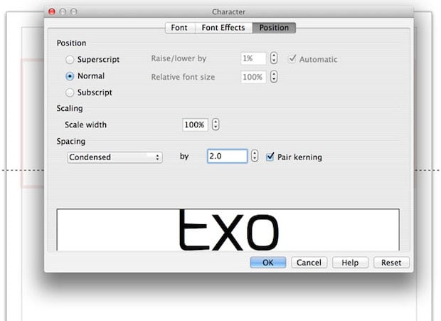
If certain letters are still too far apart, you can select them separately and apply a higher condensed spacing number.
Bonus Step: Give Your Logo a Twist
If you’ve followed the steps above, you have a nice-looking wordmark already. If you want to give it a little extra pop, try one of the following techniques:
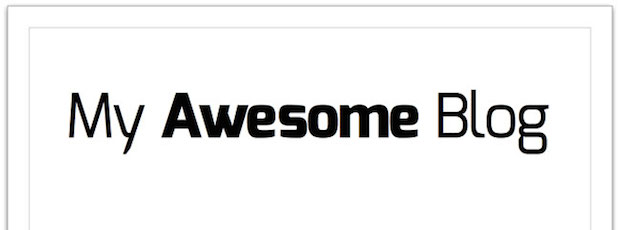
Bold one of the words. If you choose a typeface with a variety of weights, you can use some words in a lighter weight, and some bolder.
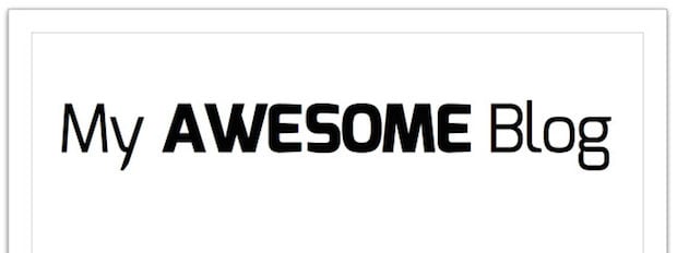
Feature one word in ALL CAPS. Choose the most important word and change it to all capital letters to make it memorable.
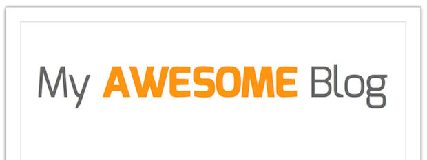
Apply color – sparingly. Add a pop of color to the most important word, and apply a neutral color such as grey to the other words. If you’ve chosen brand colors, choose one or two to put to use here.
These extra “twists” to customize your wordmark make it recognizable and easier to remember.
Export and make it live! From here, you’ll want to export it to either a .gif, .jpg, or .png format and upload it to the header area of your theme.
In OpenOffice, you’ll do this by going to File > Export. Next go to File Type, and choose one of the following file formats:
- GIF is good for images that have just a couple of colors and no gradations. In other words, flat images. The GIF format supports transparency, so if you need to place your wordmark logo over a colored background, it’s a good format to choose.
- JPEG is good for images that have gradations. This includes any art that includes photos.
- PNG is good for images that have gradations and need to be transparent.
Experiment with the different formats until you find one that gives the best-looking result for the smallest file size. Fast-loading images help your site’s speed, and that’s a big plus.
Make Your Blog a World-Class Brand with a Wordmark Logo
You don’t need to dive into a design rabbit hole in pursuit of a fancy logo.
And you don’t need to waste time and money on a design you might soon outgrow.
A well-crafted wordmark logo – in combination with savvy color and font choices – can make the difference between a blog that looks blah and one that looks polished, professional, and branded.
With this simple step-by-step formula and a few free tools, you can create your own wordmark logo to rival some of the world’s biggest brands.
Of course, this means you no longer have an excuse for a boring, vanilla-flavored blog.
A professional, attention-grabbing logo is within your reach.
So what are you waiting for? Dive in and start creating a brand that creates an impression and even adds profit to your blog!


Great post Pamela. I just read a post the other day on ConversionXL about how good looking sites do better than ugly ones and how having a bad, or uninspiring design can hurt your performance.
I think a lot of small website owners (and bloggers) know that they need a more personalised design but aren’t really sure how to achieve it. Creating a simple, stylish and not-over-the-top logo is a great first step.
Thank you, Mark! I’ve used this technique for client logos many times over the years, so I’m happy to be able to share it.
I’ve been into logos since I was a boy; drawing and creating my own logos when other boys in my class were doing their prep or listening to King Crimson! It’s something I keep returning to especially when digging up my creative streak.
You’re right, simple is best. I like a bit of colour too. My blog name is orange and bluey-grey. It seems to fit the domain name and overall personality. Got some interesting results from my Brand personality quiz. Enjoyed it. Thanks.
Pamela
Love it! Even though I’ve already got a professionally designed logo I still love it.
About those file sizes – one thing I’ve recently discovered is two cool websites compressjpeg.com and compresspng.com.
They reduce my image file sizes loads – blog post images, logos, social media icons, the lot.
Thanks for the resources, Kevin!
Great post, I have spent hour upon hour trying to great the perfect logo, and I am now unsure if I even like it
Perhaps you could give me your view on my ‘winged’ logo
http://www.leanerbydesign.com
Thanks in anticipation and a little fear
Steve
I’m guilty of having no logo, but I just wrote an entire piece about bad signs/logos yesterday. I always wonder how on earth these people think they’re good branding. I’d rather have no logo than a bad one!
Ahhh, thank you, thank you, for telling people that diving into the old logo rabbit hole is a waste of time and money. We’re constantly telling new clients that their efforts (and their $3k) would be better spent on revamping the generic design or replacing the bad copy with words that sell – and that a nice wordmark logo will do just fine, thank you very much.
Plus, I really like that you showed people how easy it is to make a nice logo from some simple elements – well done, all ’round!
Thanks, James. Rabbit hole it right! It can be a HUGE distraction.
Hi Pamela,
Great post! I avoided the getting a professionally designed logo by designing my own with an online tool. A DIY logo can save a lot of money!
I love the wordmark logo idea, Pamela. As a freelancer who works under my own name it seems to be the smartest option. I spent some money and lots of time having a logo for my copywriting business created, but in all honesty it did little to nothing for the business. It finally became clear – logo/graphics do not = freelance success! Thanks for this very thorough article.
True, Pamela. In the days when I ran an ad agency we had a joke: ‘If the client moans and cries/Make his logo twice the size’. Nobody bought anything because a logo was pretty. It’s merely a visual identifier. Folk who send emails headed by a BIG banner with a logo are missing the point: it’s the weakest message in the strongest place. And a logo header screams spam. (I’ve been trying to tell the good folk at AWeber that for ages. Their pretty email templates kill sales!)
Hi Pamela! : )
I cannot even tell you how appropriate this post is for me right now. I have struggled with a logo concept since the beginning and it has driven me crazy. My site addresses developing mental skills for business and stresses the ‘brain-heart’ connection so I’ve gone back and forth between a brain and a heart and had no luck.
A ‘word logo’ is the PERFECT solution. I’m ‘uber’ excited about getting started so thanks so so so much!
Can’t wait to see what you come up with. Please come back and post a link when you have it ready, Lynn. 🙂
Good idea. Another alternative is to spend $5 on Fiverr.
Very interesting topic, also I’m using graphic logo But i don’t like to remove. So Accepting all your points.
A fancy logo can be a waste of time and money, Pamela!
Boy, I know this one, having been there and done that. Having had some great success/impact working with designers on music artwork for a time, some years ago… I got into this head-space where I was convinced that when I launched my own business it was all about (just) having a great logo! That’s all I needed!
So guess where I poured all of the money?
In the end, the logo fitted the niche and audience. However, I can’t say it added much return on value to the brand in relation to other things that did such as getting a good writing coach and building engagement.
Since, I’ve learned some of these lessons (mostly from following you and then marrying a great designer) and can honestly say this stuff works. And it’s always great to learn more. I’m much happier with ‘word logos’!
Your ‘brand personality worksheet’ a quick useful exercise. I would go further to add that it is very helpful when you have defined your ideal client. Pinning that person down until they are crystal clear. The more I work on that ‘avatar’ the easier some of my communication and branding decisions appear to be – with results!
This is insanely good advice and I wish I had it 5 years ago, it would have saved me a lot of money. Thanks, Pamela!
“You could pay a designer hundreds of dollars to develop something only to discard it because it no longer reflects the focus of your blog.”
Well sorry, that’s your stupid fault, don’t blame the designer. Logo design is a very time-consuming and difficult process, so leave it to professionals (like me) – You wouldn’t fix your own electrics or plumbing, so why do you think you can do something equally tricky?
You ideas are why so much graphic design looks appalling, people think they can do everything themselves. Stick to what you are good at, and get other people who are good at what they do, to do the rest.
Hey Rob,
I hear you.
Having hired many a professional designer, it has always been money very well spent. In fact, I’ve hired many designers (married one) and always been pleased with the results.
However, I would go so far as to say, when you’re starting out, or beginning a blog, as many creative entrepreneurs are (and I’m guessing a lot of the Boost Blog Traffic readership is) you could easily be fooled into thinking: “if that’s where I spend all of my focus and money, that’s all I need to launch a great brand” I was (fooled.)
Pamela’s advice is spot on for those starting out and, like many starting out, they might change their heading and direction early on, many times and frequently. I did. I spent a fortunate on a logo that didn’t fit the next thing I did. And I had no money to start again. I have a feeling I riled one designer too with the thousands of design changes I wanted when I didn’t know what I was doing too! I learned my lessons.
Personally, once I got going and started bringing some money in – that was a great time for me to get a professional designer and I also had some initial ideas to present to them. That made life a lot smoother and I always went with their best advice.
I’d be interested to know from a designers point of view, if, following Pamela’s tips, someone starting out could create some initial ideas from which designers can work from professionally?
Rob,
To be honest, that is part of the designers remit. A designer should be receptive enough to study and understand what the client is about. I believe in giving people what they *need* rather than what they *want* – A good designer should be able to ascertain the ethos and the goals of that client, be they a corporate or an individual and boil that down to an essence that can be represented in a single, concise, simple and attractive motif.
Often you get people say “$5000 bucks for THAT!??” but that is the point, it has taken a lot of work and many iterations to condense it down to something which appears at first glance very simple and straightforward.
I probably do ten concepts, along with maybe ten fonts and ten more color schemes, and then go through that with the client slowly eliminating and refining the concept. This can take anything from 3 to 6 more bounces before we get to the right ballpark, and then it is a case of subtle refinement and elaboration.
From a clients point of view, I think “mood boards” are very useful. Pick out other logos, designs, images, illustrations, photos, websites and clippings that appeal to you, and also might represent what message you are trying to get across, along with things like font styles and colour schemes. It all helps build that picture of what it is you want. Remember, just because you are an IT company doesn’t mean you may not like something on a butcher’s website – it is not always about the message, but the ethos that is important.
Hope that helps,
Rob
Where did she say that the designer should be blamed?
She’s not saying that you should NEVER hire a designer, nor is she knocking it. She’s saying, if your blog is in the early growth stage, it’s not the best investment.
That line you quoted…
“You could pay a designer hundreds of dollars to develop something only to discard it because it no longer reflects the focus of your blog.”
She’s not saying the designer did a bad job on the logo. She’s saying, when your blog is in its early development, it’s incredibly subject to change. So the logo you pay hundreds of dollars for now might not fit with your future brand.
Rob Neal: I don’t think anyone is disputing the value of graphic design. I think the point is that when you’re beginning blogger, graphic design is not the best place to spend your time and money. You can come back and hire a professional, such as yourself, once you are successful.
Nice read! I think bloggers and website owners can really benefit if they learn how to use Photoshop. It’s not a tough skill to learn and it can be used to create all sorts of images like logos, sidebar images, advertising images, social media images, etc.
Except Photoshop is NOT the right tool for logo design. You need to work in vector format, so that the design is scalable and resolution independent. All my logos can fit on anything from a matchbook to the side of a truck with no loss of quality.
I would suggest Adobe Illustrator or Corel Draw for that purpose.
Or indeed Inkscape is a fabulous free Open Source tool and for most people much less of a learning curve than Adobe Illustrator.
I would never pay one designer a bunch of money to design a logo, because there’s a good chance I wouldn’t like it. Design contests, on the other hand are a FANTASTIC resource.
I’ve used 48 hours logo twice ($100 and $125) and ended up VERY satisfied with the results….even better, I’ve ended up with something completely different (and better) than I could have imagined on my own, or with just one designer.
I have a design contest that is ending today and have at least FOUR logos that I would use from that. I agree that a wordmark is better than paying someone thousands of dollars for a logo…but I think design contests are a better option if you are more picky about what your logo looks like.
No professional designer would ever submit to doing competitions.
Most designers will expect an up-front deposit to eliminate timewasters, but if you are genuinely not happy with the work you receive, you do not have to pay for it.
Every creative is different, it’s a very subjective thing, it’s not that they are necessarily good or bad, they are maybe just not your bag, so shop around and find designers who’s work you do like first. Remember, it’s a big wide world out there, so you have the entire planet to choose from.
Lots of professional designers do competitions. Many of them are just in other countries, such as India, Russia, and China.
I LOVE your post, Pamela! I have a lot of small business clients who spend more time and money designing their logos than they do their websites, and they simply don’t need something professionally designed at this early stage of their business. I want to get them online quickly so they can get started sharing their business with the world, rather than sitting around a table analyzing logos and spending their start-up cash. Thank you for confirming what I always wanted to say, but with the experience and proper explanation to back up your idea!
Thanks, Pamela! I’m going to do this for sure. I’ve always heard not to waste a lot of time and money on logos in the beginning, but you are so right that the standard headers can be pretty “blah”.
Thank you so much for this, Pamela! Perfect timing. I was just looking on Creative Design, Elance & CB et al for inspiration and you wrapped it up in a nice package & tied the bow. Now to search out colors for a certain generation (great tip). Best to you.
For colour combinations, try this tool, most pros swear by it, and it’s free!
https://kuler.adobe.com/create/color-wheel
I’ve loved the wordmark idea since I first ran across is, but I found a great twist was to add some very simple clip art. My logo is my name written in a script font. I found a free clip art of a pen and used paint.net to position the pen at the very end of my name, and it looks like the pen has just finished writing my name. To me the logo says ‘writing’ (my service), personal (script/handwriting is more personal than typing) and professional (black and white). So far, my clients seem to think so too!
Jessica, I would just add that you have to make sure the license for the clip art allows it to be used as a logo. In some cases, it’s not allowed, and using it as logo art could get you into legal trouble.
Pamela, Good point and I totally agree. I started out as a freelancer on article submission sites like Helium and Suite 101 before I realized what a waste of time they can be, but their strict rule on images taught me a lot about image copyrights and what can and cannot be used. To be on the safe side I almost exclusively use images that have been released into the public domain. It’s harder to find, and takes some work to verify that a given image is, in fact, public domain, but the long term peace of mind is worth it!
And licensing also applies to fonts. Make sure the font you use allows commercial use. Many free fonts are only licensed for personal or non-commercial use.
Good grief, some of this is still Greek to me, but my daughter will translate.
I get the main idea, though, and I love it. Thanks.
My site helps deals with grief, and there are no cute images that work. I thought about a crumpled paper background, and can add that late, I think. In the meantime, just the words, in a memorable but calm state, would be perfect. Never thought about it before. Just what I needed. Thanks, again.
And low, thus speaketh she the truth, for verily had there been a great gnashing of teeth within the design kingdom!
Having earned my humble crust as a graphic designer since—well, let’s just say it’s been “a while” and leave it at that—I’ve come across all kinds of design advice and really, much of it’s been utter tosh.
How refreshing then to find BoostBlogTraffic.com AND Pamela Wilson’s richly detailed, solidly outlined, bang up advice on what to do and, portably more importantly, what NOT to do.
Devoid as my own site is at the moment of—well, pretty much any kind of logo really (cobbler’s children and all that), this article has inspired me to get my rear in gear. Nicely said, Pamela. Thanks for helping “spread the gospel”, so to speak.
Gary, thanks for speaking the truth, and for the comic relief! This is not a topic that people should get all worked up about. It’s supposed to be fun.
Pamela, I’m such a font addict that I had a fontgasm reading this.
Thanks so much for pointing out the need to pay attention to font styles, colors, and spacing/kerning/setting your logo. I learned all these design elements as an early internet adopter, but also as a newspaper editor in college (a lot of these guidelines apply to papers, too).
Taking this a step further, you also need to integrate all these ideas about font and color into your site, too. You could have the coolest logo but have no color or visual interest elsewhere, or you could go too crazy with color and serif fonts to the point where the reader’s head wants to explode. Take a little time to balance everything out, and then move on to building those quality relationships with readers and other bloggers.
Bookmarking this and will be sending all my web design clients to have a read 🙂
Great. Now I know the term for what I used to refer to as ‘your name written in a pretty font’. Bookmarking it for sure. 🙂
Pamela, I’ve treasured this advice of yours for some time now, and even used it just yesterday!
Pamela, you have hit the nail on the head with this post. When I started my blog, I wasted dozens of hours having logos designed on Fiverr (and then not using them), and fidgeting with my logo. I could kick myself for wasting so much time when my audience so small and didn’t care about my logo. GREAT post.
Hi Pamela,
I enjoyed this post, it has lots of practical tips for non-designers. I created a Wordmark logo for my website: http://www.workreadplay.com. It’s not perfect, but it does the job. I’d love to know what you think.
I like it, Bryan! That little touch with the script font and color in the word “play” gives it a nice flair. Good work 🙂
Thanks for looking at it, I look forward to your next post.
A very welcome article. About time someone debunked this obsession with logos. It’s part of the whole misguided “Branding” compulsion. Bloggers, even those very, very few making any sort of income from their efforts, are not “brands” in any meaningful way. Branding (and Logos are an intrinsic part of branding) has a very specific purpose in the marketplace and making comparisons with bloggers and their websites is completely erroneous and, frankly, risible. Finding a blogger interesting enough to read is not the same as scanning shelves for your favourite baked beans. It just isn’t.
Great post, Pamela. I like to add too that I test out my wordmark logo on my iPhone using free aps such as Phonto and PicLab. It’s fun to test different fonts, colours, sizes, spacings and so on. Once I found one that I like, I’ll try to replicate that on Illustrator (I’m a complete novice when it comes to design). Works well on my current blog and on most of my other projects too. Hope that helps! 🙂
Thanks for that resource, Aqilah.
Thank you for this awesome post, Pamela! I have a non-profit company and I’m in the process of developing it’s brand. I was never a big logo fan, but I did want something significant to represent my company.
This blog post was just what I needed. My company (CayWriters), at the moment, is just a page on my website, but I didn’t want to rush into creating a website (or anything else) without first carefully developing the company: goals, purpose, etc.
I’ve just signed up for your newsletter. I look forward to learning how to create my company’s brand.
Thanks, Jon for bringing these wonderful resources (and people) to us!
As a graphic designer I was ready to give you some butt whoppin’ for that headlined. But then I figured if the blogger is on BBT, they are probably sharp to craft a headline that pushes buttons. Great post, nothing to add 🙂
Hi Pamela,
I have read at many blogs about logos. Though i don’t have much knowledge about logos still we all know that simple is the best. The logo which can attract, make a brand symbol, by which people will come to know about our blog.
We can go for colorful logos but it’ dependent on the blog for which we are choosing the logo.
Suppose if we want a logo for a fashion blog then a logo with color will be best.
Thanks for sharing this post with us.
~Ravi
Hi Pamela,
I love your idea of using the wordmark logo. It is something so obvious that I think many people including myself overlooked.
You see, I have just set up my blog not too long ago, and i was already thinking of hiring someone to come up with a fancy logo for my blog. I guess I won’t be needing that service any more. At least in the near future.
Thank you for your tips. Glad to find this post.
Fantastic post Pamela! I learned so much. Never thought about Word Mark Logos and selling through words. Very exciting stuff. Thank you.
Excellent post Pamela! I love your simple solution to creating a logo that makes us look professional without taking a lot of time. I was a graphic designer previously and I know how much time doing a full-blown branding guide and logo can take. My forte has always been doing layout, not logos, and I’ve felt secretly guilty that all I did for my logo was style my name. Now I can say it’s a wordmark logo, LOL! I am rebranding my business at the moment so this article (and your branding guide) has been very helpful, thank you!
I personally believe a nice font logo is much better than those fancy artwork. People go mad about dimensions and designs to make a logo; I wish they did same justice to content.
What valuable and timely information, Pamela.
Word Mark logos are efficient, effective and enough! Thanks for providing a deep dive on the details.
Hi Pamela, I enjoy your tips to save time and money on logos. I think when it is wasted it is also because bloggers look at their logo as something cast in concrete. Maybe once you get to a 1,000 subscribers you may want to be more careful about making changes to your logo, but before that just make change part of the process – a great way to take off the pressure from that 1st logo design.
My logo is basically a text logo, just a little spacing fanciness and perspective. It’s hard when you have a company with a long name like: Stick In Your Head (thank goodness we didn’t do “Stick In Your Head Marketing” like we were going to!!
Wow, this is a really great, and helpful, article Pamela. I love the step by step instructions for creating a simple, cheap yet effective logo. I paid a branding agency a heap of cash to create the logo for my first business and although I’m still happy with it years later, I do think the money could have been spent elsewhere. I’m in the process of creating a new website for my freelance writing business, and am certainly going to give your suggestions a go. Thanks for sharing the tips! 🙂
Hi Pamela,
Today I stumbled at your blog, love your ideas. You shared lot of coll tips to make awesome logo. I am new blogger and looking this exactly what you share. I also love word logos. And now I will create for one of myself using your tips.
Thanks to share coll tips with us 🙂
Regards,
Jyoti Chauhan
Logo is one of the most essential thing for any website which reflects a good impression on users and give them an image for your brand, product or website. It’s an informative post shared here and useful from all aspects.
A logo is identity of your blog. This is the first visible part of your blog for new readers to capture their attention.
and moreover a logo is brand visual of your blog.
People can recall the logo of your blog when they hear your blog’s name in any conference or see it mentioned on any big website.
When I started my blogging career, I was very much clear about having a brand look for my blog.. so logo was my first priority. Once my logo was finished, I worked on my blog’s design and made it super attractive to capture first time reader’s attention.
This article is for those who are not using any brand logo on their blog, and for them who are using very low quality logo.
Pamela, you did complete justice by explaining crucialities and importance of having a good logo.
I am launching few more projects very soon, so going to keep all the points in my mind while making a new logo.
Big thanks..
Have a great day.
Thanks, Pamela!
For years I had this uneasy feeling that investing in a designed logo was, in most cases, not economically savvy.
Now you have made it clear.
And anyone who agrees with me must be brilliant…
Not only that, but you have shown a powerful, workable alternative. In fact, that is how I created my two own first logos before I had pity for a designer…
Hi Pamela, I am in the process of launching my blog and was searching for ideas & inspiration to help me create a brief to provide a graphic designer, however; I’ve now created a logo & header that is absolutely perfect thanks to your advice and step-by-step process. Thank you so much for sharing your knowledge!
Great post Pamela,
I have been creating logos like this since my first blog.
I remember reading a post on StevePavlina.com where he puts emphasis
on creating a value. He still doesn’t have a logo for his blog.
Once upon a time I thought I needed a logo. Nothing seemed right. Too busy. Too purple. Too boring. Too “I got sick of it too fast.” Now? I use my tag line, “Let Go. Move Forward.” I created the header for my website using canva.com. I used my own photo. Right now it totally works for me 🙂 http://peggynolan.com
So basically this is a guide to look like the generic brand of X service.
Follow the instructions of this blog post and you too can blend in with the crowd! I really like the advice.
http://i.imgur.com/zMymVRt.jpg
Pictured: Your brand.
Hey Pamela, Loved this idea totally. You can do it on your own initially. But yes there are designers who can help you in getting a fancy logo, in case if you want!
Anyways loved your post
Hi Pamela,
I have just Stumbled your website and found impressive content. You have shared a lot of helpful tips to create an impressive logo. As a blogger, I understand the importance of branding and logo for the blog or business. I like creative logo designs. Every year I try something new, and this time, your tips will help me.
Thanks for these tips!
Best
Gaurav Kumar